
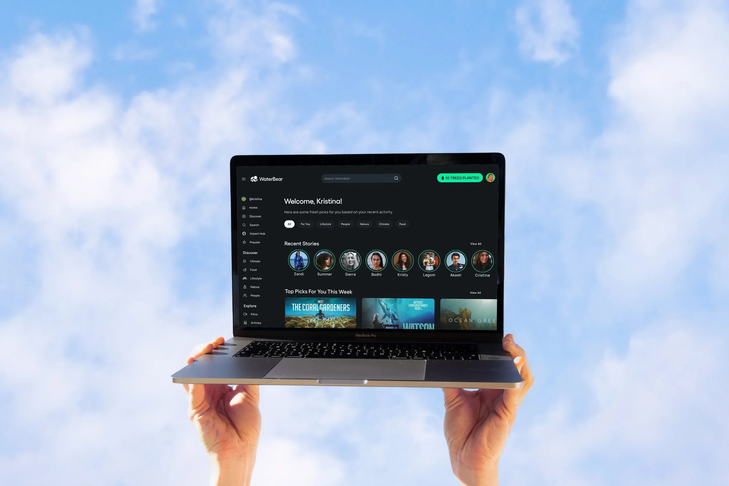
Rebuilding engagement for a platform built to change the world, not just stream it.
I joined WaterBear as Senior Product Designer and the sole designer on the product, working directly with the CEO, Head of Product, and engineering lead. My remit covered the full user experience: from onboarding and activation through to engagement loops, campaign participation, and platform-level UX systems.
OverviewTITLE
Senior Product Designer
TEAM
2 designers (led)
PLATFORM
iOS · Android · Web
STAGE
2024 → Present
Janete Perez — Chief Product OfficerSam Sutaria — CEONoel Baron — Chief Technology OfficerMirko Tosoni — Global Head of Marketing & CommunityContent Team
Impact & Partnerships TeamWorked directly with
Onboarding & activation
End-to-end redesign of sign-up to first meaningful interaction
Engagement systems
Behavioral loops, reinforcement patterns, and repeat participation
Watch for Impact
Full campaign experience from entry point to post-watch action
Platform UX & systems
Scalable patterns, content discovery, and cross-surface consistency
The Challenge
In mid-2025, paid marketing was discontinued and engagement metrics dropped across the platform. But the numbers exposed something deeper. WaterBear had a product problem, not just a marketing one.
PROBLEM 1
Value wasn't landing early enough
Users arrived without a clear sense of what made WaterBear different from any other streaming service. Without that understanding, there was no reason to stay — or come back.
PROBLEM 2
Watching ended at watching
The platform's real value was participation — campaigns, actions, real-world impact. But the product treated content consumption as the destination, not the starting point. Engagement ended when the video did.
PROBLEM 3
The path from inspiration to action was invisible
WaterBear's impact model — partnerships, donations, measurable outcomes — was powerful but abstract. Users felt something watching the content. They just didn't know what to do with that feeling.
The opportunity wasn't to redesign screens, it was to rethink engagement as a behavioral system that connected storytelling, motivation, and action into a single coherent experience.
Product Strategy & Design Approach
Rather than treating this as a visual redesign, I approached the problem as a behavioral and systems challenge. Three principles guided every decision.
Clarify value proposition early
Early exploration showed users needed to understand immediately what made WaterBear different — and why their time on the platform mattered. I redesigned onboarding to prioritize clarity over novelty, introducing the platform's mission and mechanics in plain language rather than abstract impact metrics. The goal was to get users to their first meaningful moment faster.
Design for behavior, not consumption
A key reframe was shifting the experience from watching content to participating in change. This meant designing UX patterns that reinforced progress and contribution, made impact feel tangible and immediate, and encouraged repeat engagement without pressure or guilt. Every interaction was evaluated against one question: does this bring users closer to action, or further from it?
Simplify complex impact mechanics
WaterBear's impact model involves partnerships, donations, and measurable outcomes — all of which can feel abstract to users. My role was to translate complex backend mechanics into intuitive front-end experiences: reducing cognitive load while maintaining transparency, and designing interactions that felt empowering rather than transactional. This required close collaboration with the impact and partnerships team to ensure accuracy without sacrificing usability.
Key Design Contributions
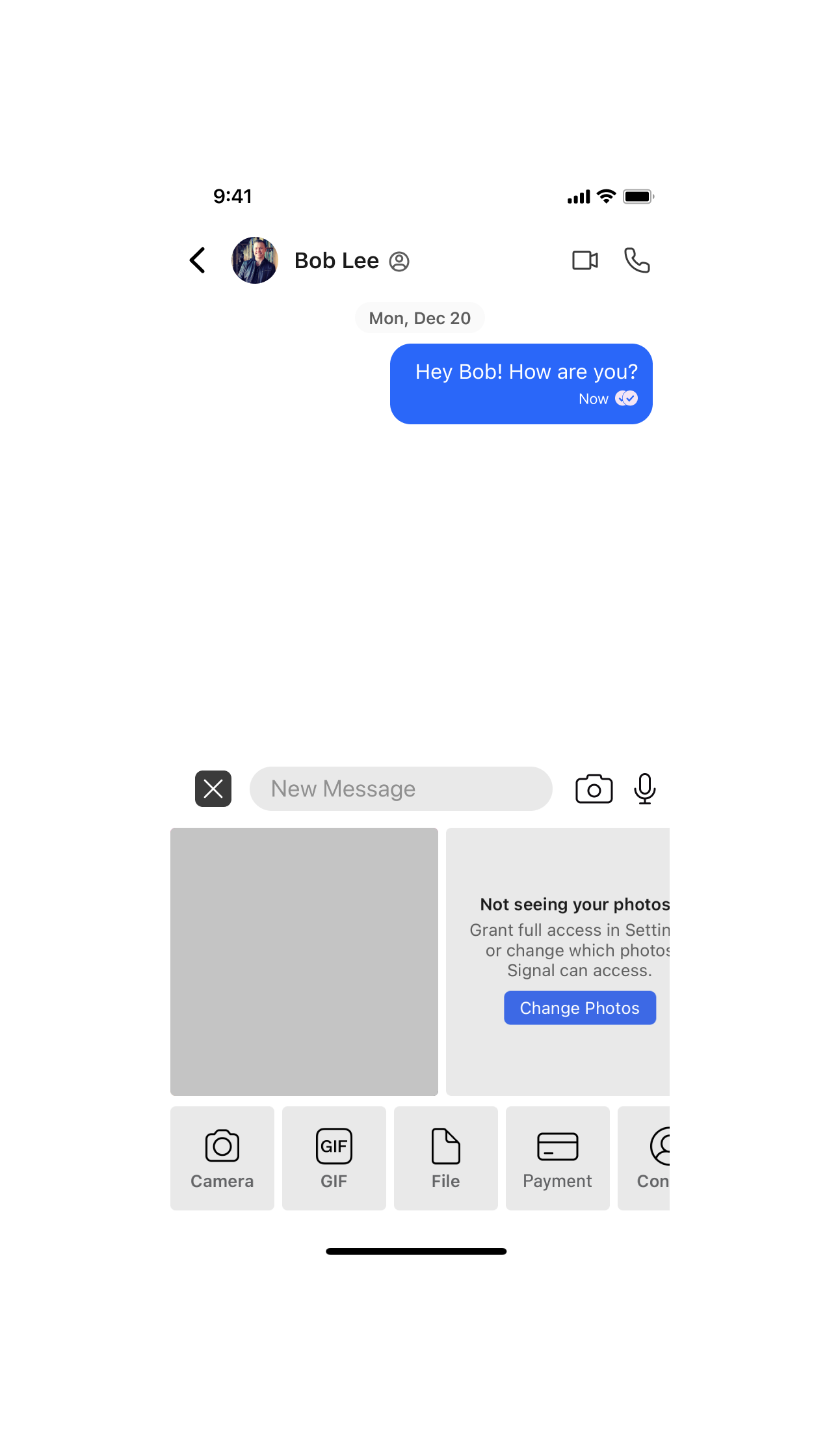
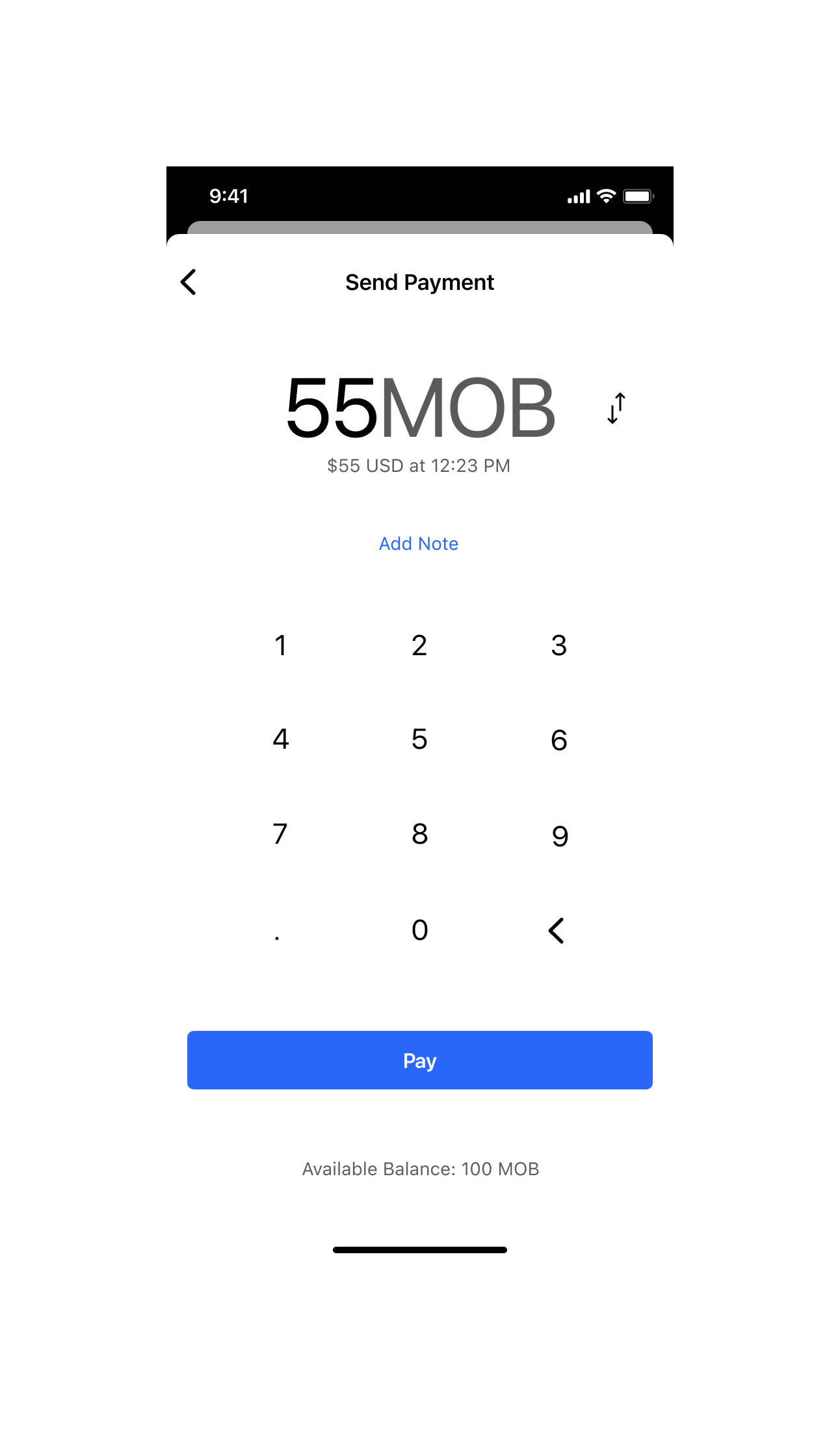
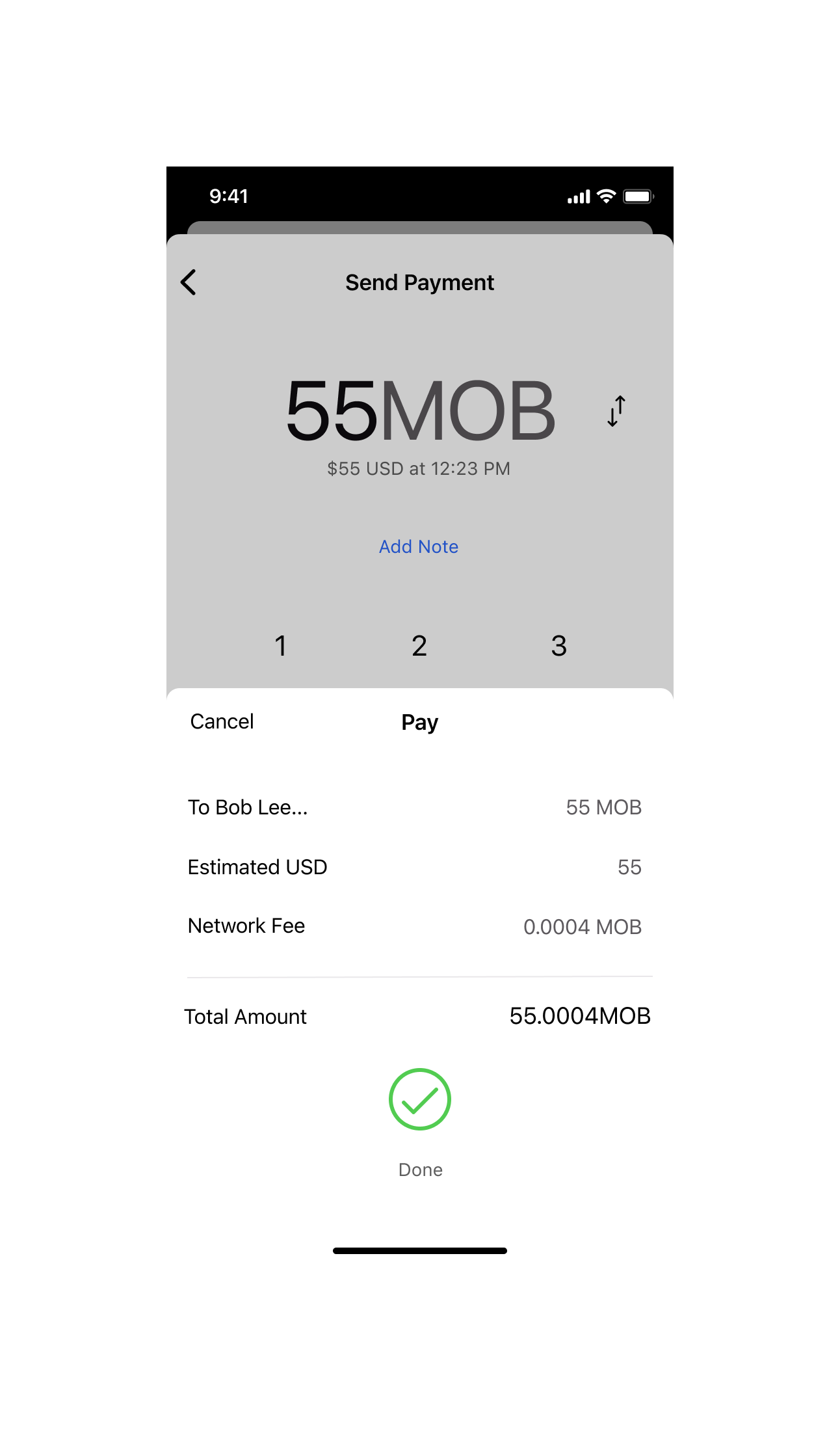
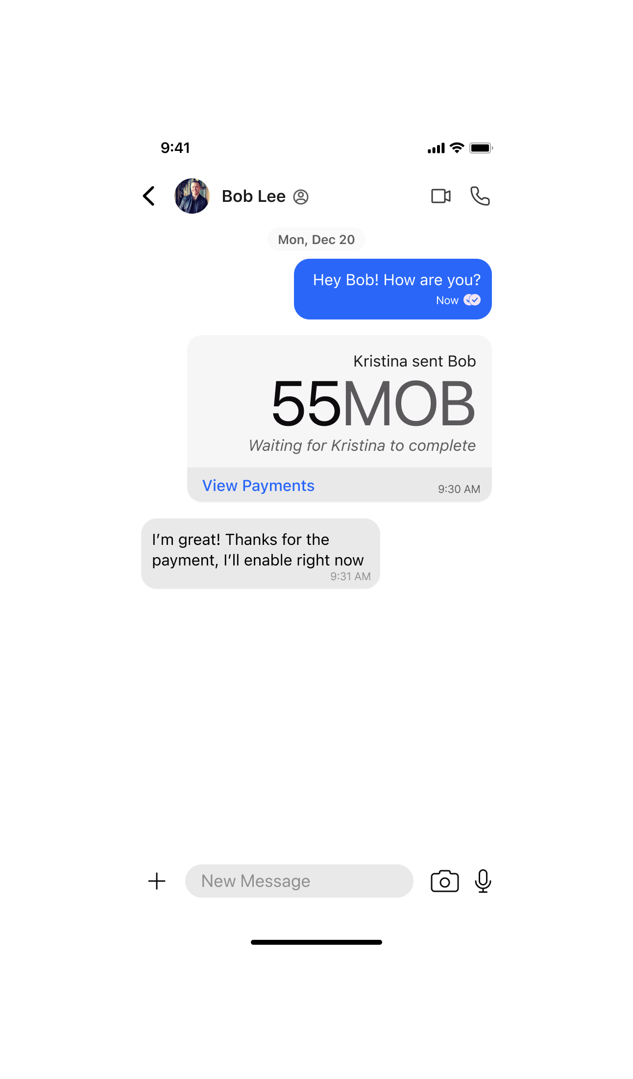
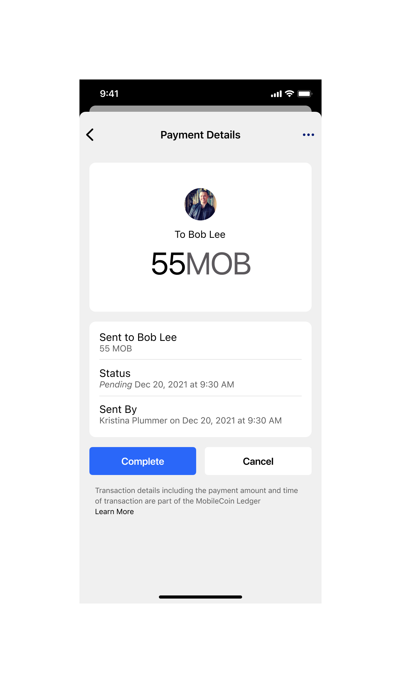
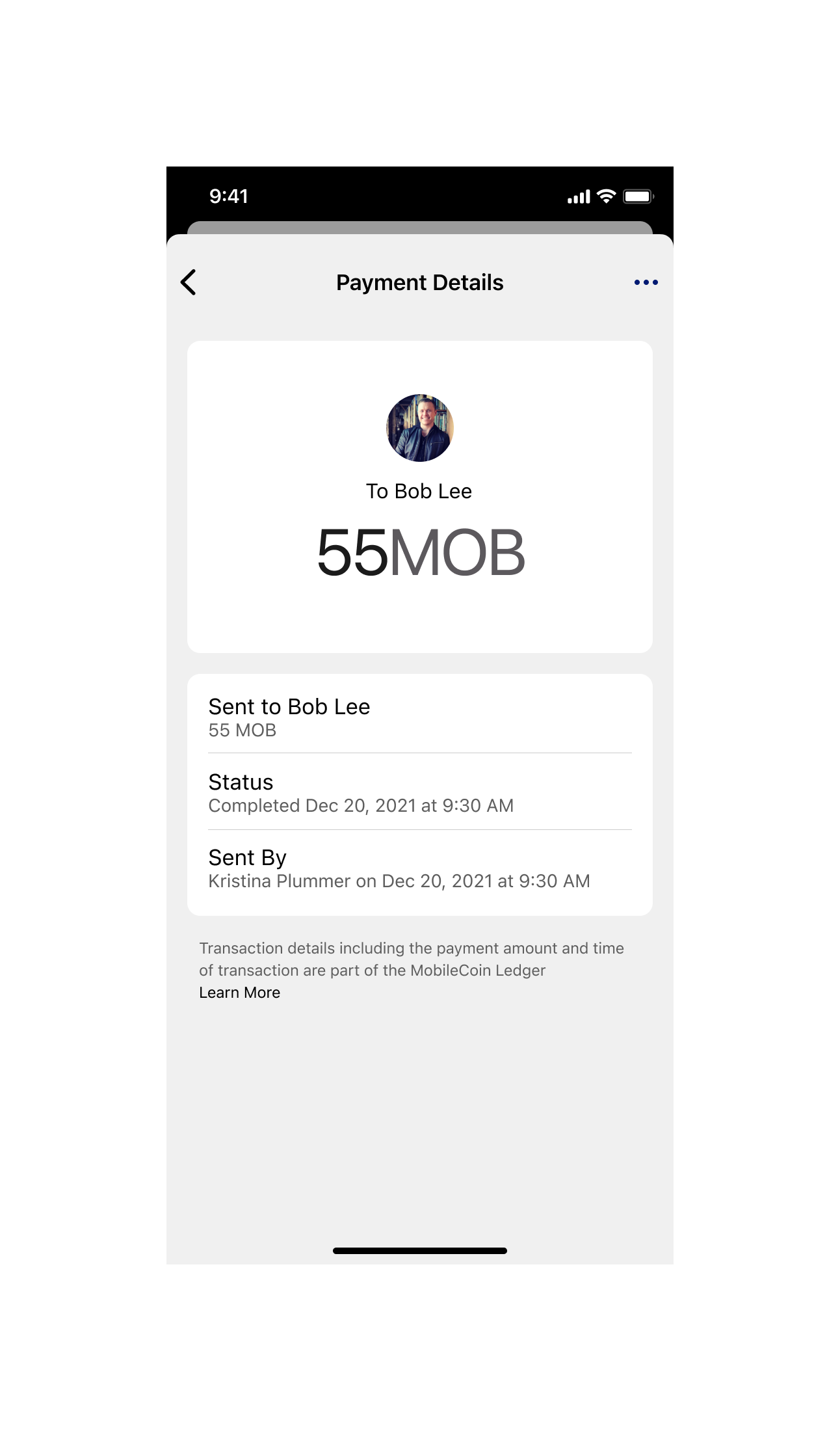
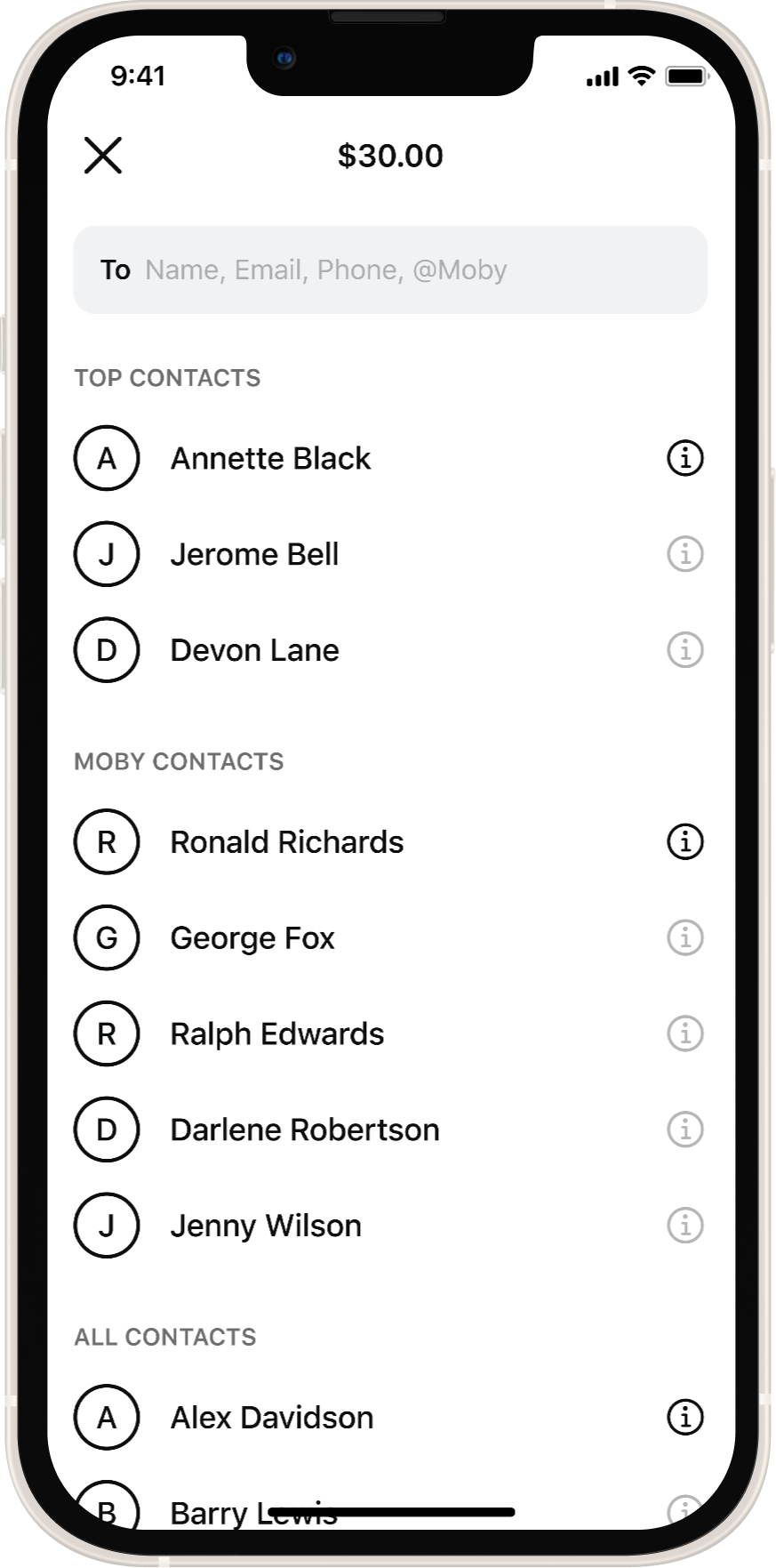
Designing payments for Signal
40M+ existing users · Cross-company collaboration
Signal had built one of the world's most trusted communication platforms on a single promise: privacy. Adding payments meant extending that promise into a category — financial transactions — where trust is even harder to earn. Getting it wrong wouldn't just be a bad feature. It would break what Signal had spent years building.
I led the design of the in-message payment experience, working directly with Signal's design team to ensure every interaction felt native to their product — not bolted on from ours.
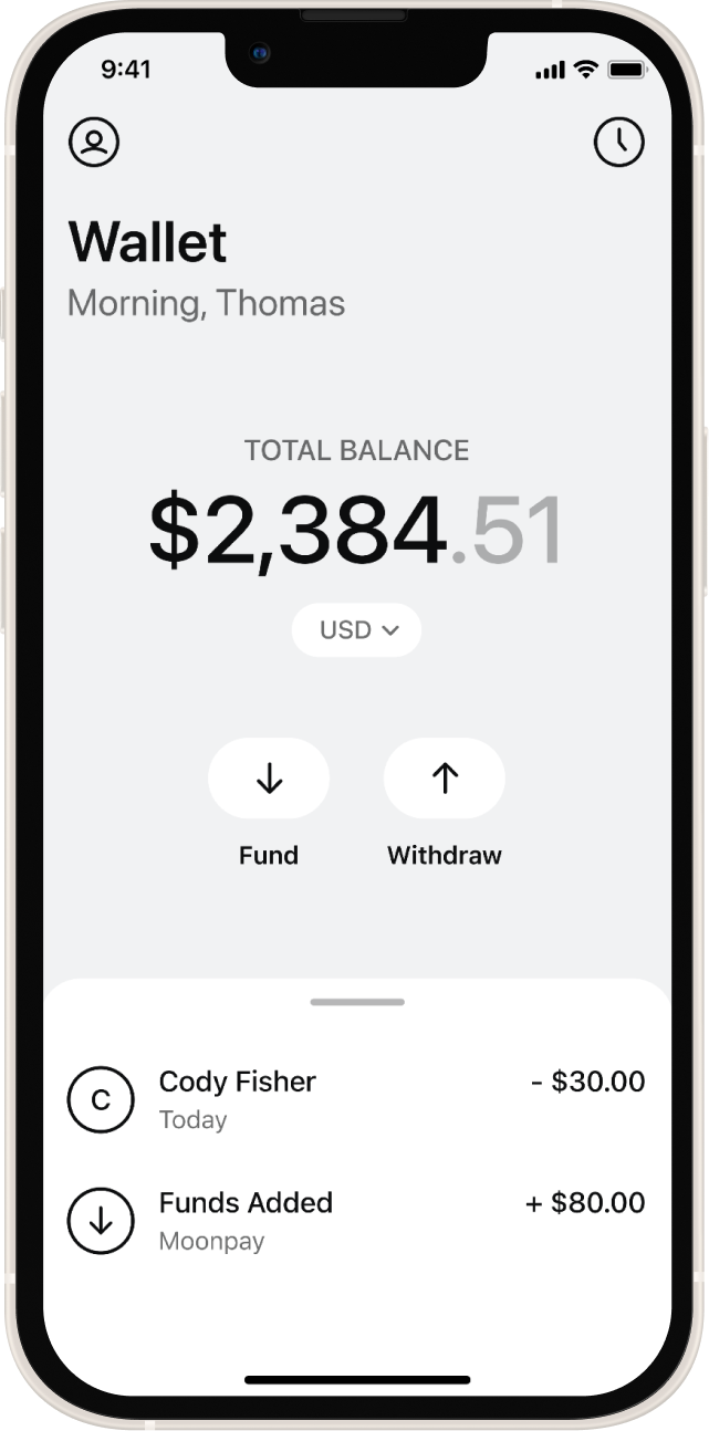
Sending to non-activated users
Payments had to work even if the recipient hadn't set up payments yet — funds held until they did.
Signal’s design standards
Every pattern had to feel indistinguishable from Signal's existing UI — their brand, their philosophy, their users.
Funding wallets inside Signal
Users needed a way to add funds without leaving the app or encountering crypto friction.
External wallet interactions
Designed flows for users moving funds between MobileCoin and external wallets without confusion.
The Result
A payments experience that shipped to Signal's full user base — designed to feel as private and trustworthy as the messages it sat beside. This required sustained cross-company collaboration, careful UX judgment under constraint, and the ability to design for an audience and brand that weren't mine.
Covered at launch by TechCrunch and CoinDesk
Communicating Privacy Simply
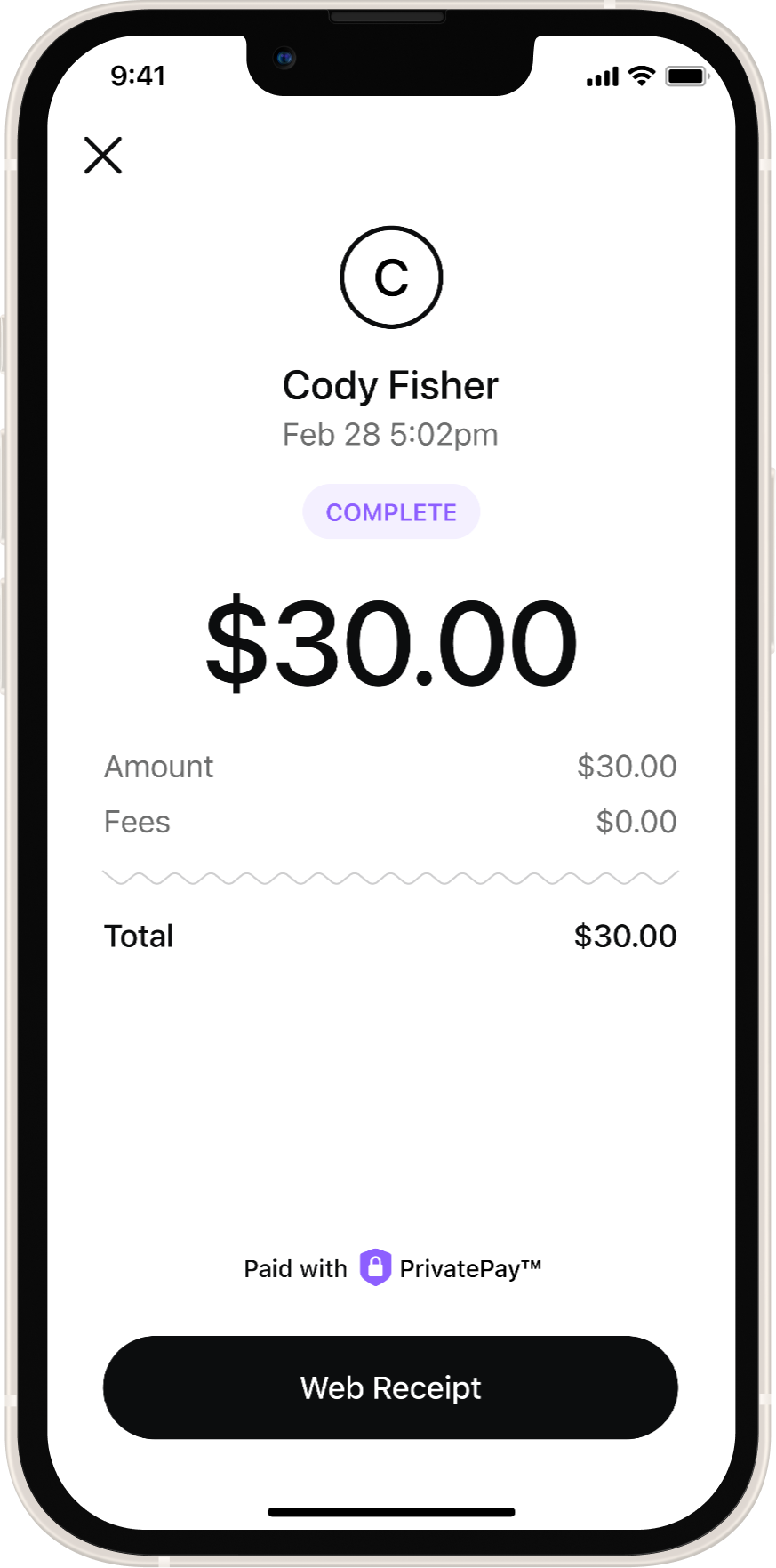
We trademarked PrivatePay to make encryption understandable.
UX strategies included:
Clear labeling of private transactions
Subtle visual treatments such as blurred sensitive data
Consistent iconography signaling security
Plain language explanations
The goal was confidence without fear.
Covered at launch by Business Wire
Western Union Prototype
I worked with the executive team to design a prototype demonstrating how users could:
Convert MOB or eUSD to cash
Transfer funds through Western Union
Withdraw at physical locations
The prototype supported partnership discussions and strategic alignment.
Core UX problems I solved
-
![]()
Explaining wallets without crypto knowledge
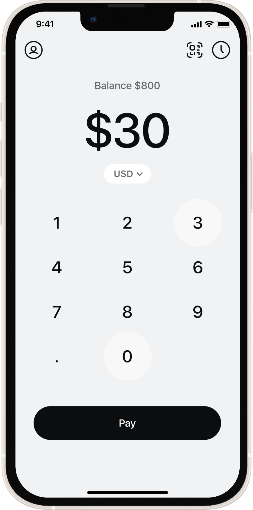
Most users didn't know what a wallet was, why they needed one, or how blockchain worked. I designed onboarding that framed wallet creation as a simple account setup — familiar language, no technical prerequisites.
-
![]()
Hiding blockchain complexity
Users interacted with familiar payment metaphors — contacts, amount entry, confirmation. Blockchain operations happened entirely in the background. The technology was invisible; the experience was human.
-
![]()
KYC wait states
Compliance checks created delays with no feedback — a recipe for abandonment. I designed status messaging and progressive disclosure so users always knew where they were in the process and why the wait was worth it.
-
![]()
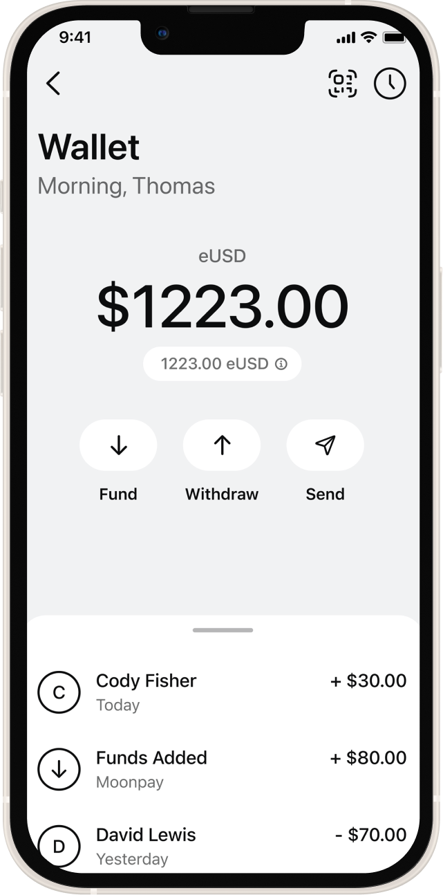
Stablecoin education
We introduced eUSD to solve crypto volatility — but only if users understood what made it different from MOB. I created visual and interaction patterns that clearly distinguished stable value from volatile assets without requiring a finance degree.
-
![]()
Sending without a recipient wallet
We enabled payments to phone numbers or contacts even if the recipient hadn't created an account yet. Funds held securely until they onboarded. This removed the biggest edge-case friction point in peer-to-peer crypto payments.

What shipped
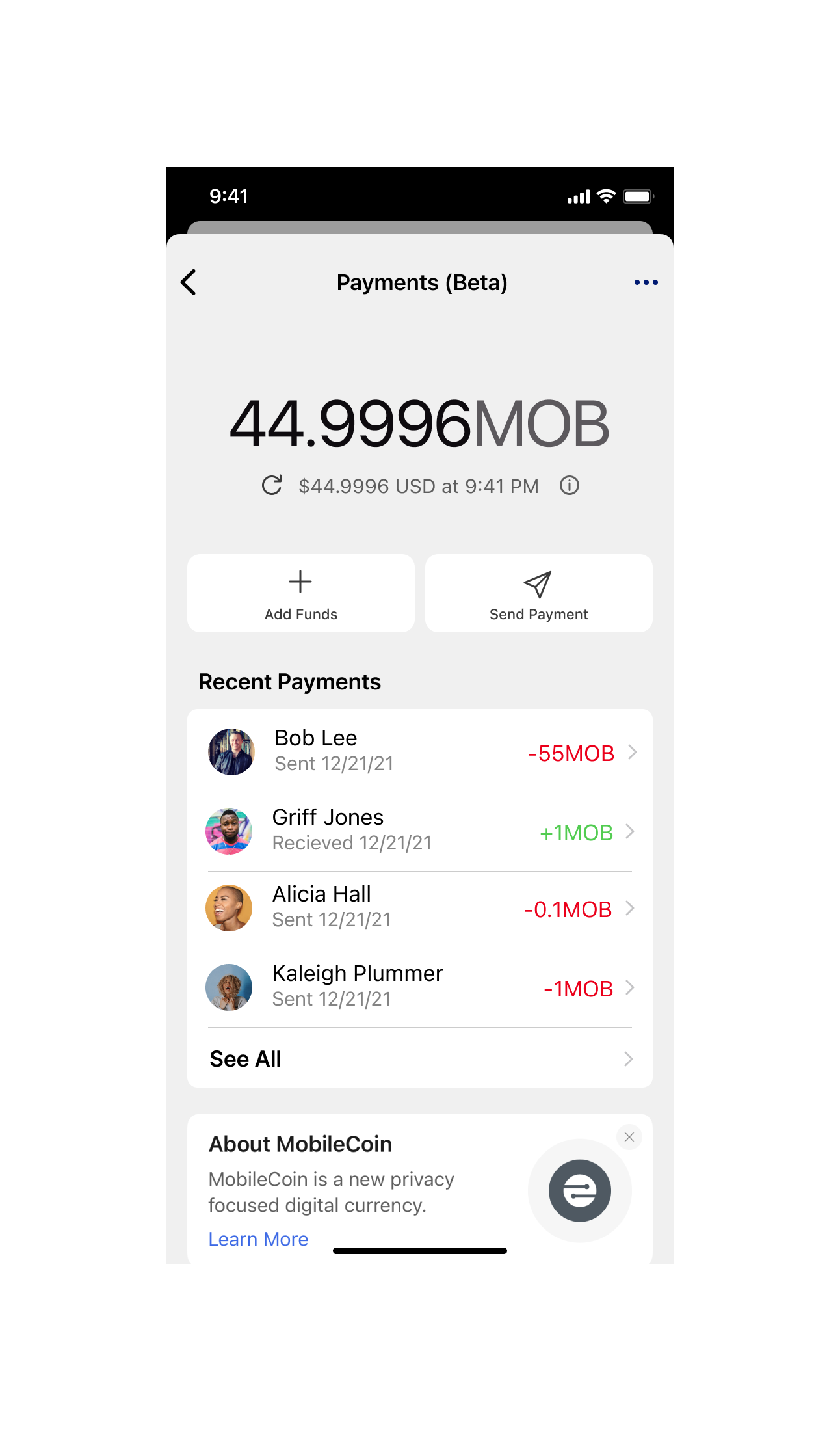
Detailed analytics are confidential — but the work shipped, the partnerships held, and the product it built is still live.
January 2023 Moby launched
Consumer payments app live in app stores — built from zero to shipped with a team of two designers.
Covered at launch by TechCrunch • Business Wire
PartnershipSignal integration shipped
Payments accessible to 40M+ existing Signal users at launch — designed to feel native to Signal's product.
Announced on Signal’s official blog
Executive partnershipWestern Union prototype
Prototype designed to support strategic partnership discussions at the executive level.
February 2023 eUSD stablecoin launched
First stable asset on the platform, with new UX patterns distinguishing it clearly from volatile crypto.
Covered at launch by CoinDesk
IPPrivatePay trademarked
A UX concept I developed to communicate encryption in plain language became a trademarked brand asset.
Covered at launch by Business Wire
Lasting foundationProduct continues as Sentz
The design system and product foundation built during this period continues to underpin the product today.
Reflection
This project strengthened my ability to translate complex technology into accessible experiences. Designing at the intersection of finance, privacy, and compliance required deep collaboration across engineering, legal, and leadership teams.
It also reinforced the importance of trust as a design outcome. Users adopt financial tools when they feel safe, not when they understand every technical detail.
Acknowledgment
Bob Lee was not only the Chief Product Officer on this project, but also a dear friend and mentor to me. His belief in building technology that empowers individuals shaped the direction of this work and my growth as a designer.
After Bob’s passing in 2023, I chose to step away from the company to process the loss and take time for reflection. Working alongside him remains one of the most meaningful experiences of my career, and his commitment to accessibility, generosity, and human-centered technology continues to influence how I design today.